There is a recent QJE paper reporting a LinkedIn audit study comparing responses to requests by Black vs White young males. I loved the paper. At every turn you come across a clever, effortful, and effective solution to a challenge posed by studying discrimination in a field experiment.
But, no paper is perfect, and this post focuses on a shortcoming of that QJE paper. A shortcoming that I believe is shared by many experimental studies (in and outside the lab): lack of diversity in the chosen stimuli. While the shortcoming is common, it’s under-appreciated, and the QJE paper provides a visually compelling demonstration.
The QJE paper in a nutshell
The authors generated about 400 LinkedIn profiles of fictitious young men, randomly assigning race via computer-generated images (this post will be about those images). From those profiles they sent a total of 30k+ requests to connect to random people on LinkedIn. To those who accepted the request, they then sent a private message from that fake profile soliciting career advice. Black profiles had lower connection rates, but comparable rates of receiving advice (given that they connected).
Things I really liked
1. Research question is important.
2. Race is manipulated via images rather than names. See Colada[36] & Colada[51] for issues with names.
3. The authors created pairs of stimuli, using GenAI to make one fake photo, and then an image editing algorithm created a ‘twin’ of that photo in the other race (having pairs of stimuli increases internal validity).
4. The authors created a cool Captcha-type task to verify the AI images looked realistic (they did).
5. The authors randomly swapped images, rerandomizing race, before sending direct messages, avoiding the nasty selection issue that race is not randomly assigned when you can only send messages from accepted accounts. (So clever!)
Stimulus Plotting the QJE study
The QJE paper reports stimulus-level results, that is, results for each Black-White pair, using the figure below. Lines are red when the within-pair difference is in the predicted direction, the profile with a Black man is less likely to have a connection accepted than the profile with a White man. Lines are blue when the difference is in the opposite direction. About two-thirds of lines are red.
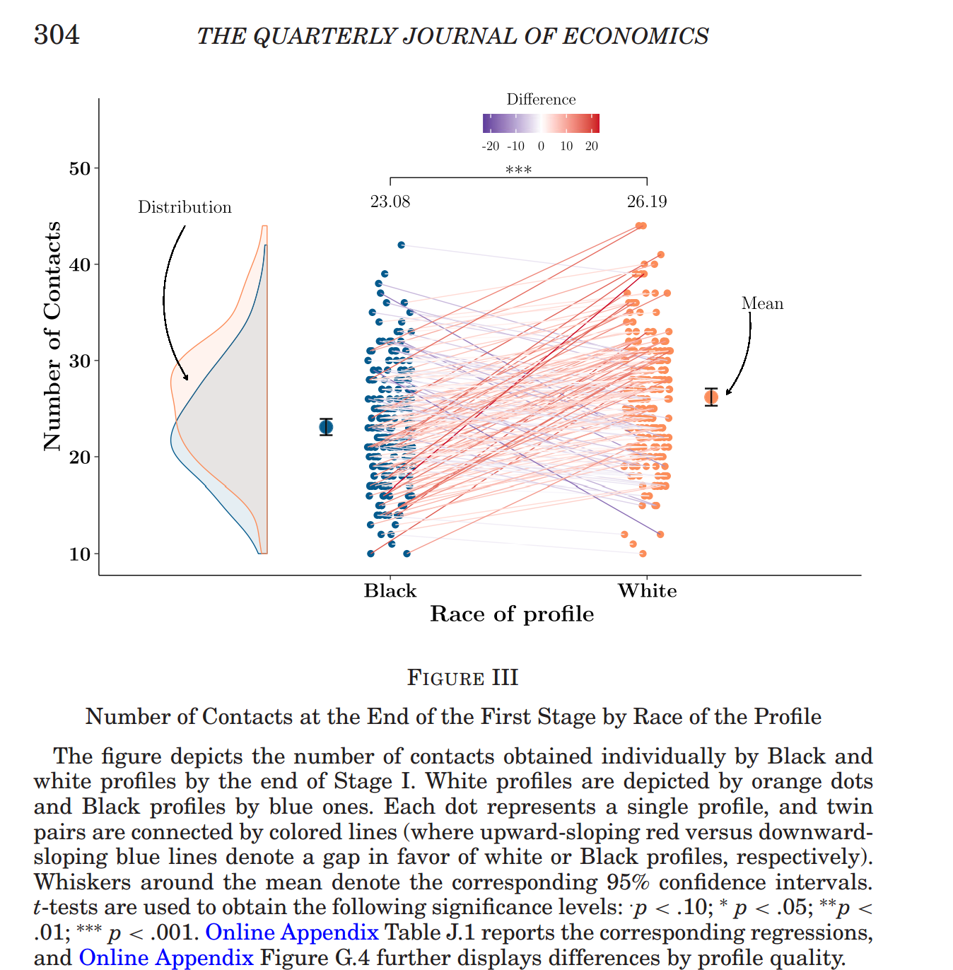
Fig 1. A figure from the QJE paper
In Colada[126] I discuss ‘stimulus plots’, which we proposed in a recent JPSP paper to be used to depict stimulus level results. Practicing what we preach, I constructed a stimulus plot for these same data (which the original authors posted).

Fig 2. Stimulus Plot for mean acceptance rates for Black and White photos
The figure sorts the 197 photo pairs from largest effect favoring the White photo (pair #158, +25 pp), to largest reversal (pair #132, -17 pp). While the average overall effect is a 3 pp higher acceptance rate for profiles with a White photo, the stimulus plot shows plenty of variation in effect across stimuli pairs.
But, is there a surprising level of variation in effect size? In econ jargon, do we have a “heterogenous treatment effect?” After all, even if the true effect were the same for every photo-pair, say that 3 pp, our estimates have sampling error and will deviate to either side of 3 pp. To account for this variation, in our JPSP paper we propose a second stimulus plot contrasting observed with expected variation. I continue practicing what we preach and report that plot in the next figure.
Each marker shows the estimated effect for each stimulus (vertically subtracting the White markers from the Black markers in Figure 2).

Fig 3. Stimulus Plot for effects on acceptance rate for profile with Black vs White photo
So, e.g., that left-most marker, shown next to “Biggest effect”, corresponds to pair #158 in the figure above, 14%-39% = -25 pp.
The green line shows the expected variation in effect size across 197 estimates, after sorting them post-hocly based on observed effect. The line shows that, if the true effect were 3 pp for all 197 stimuli, the estimates would range from about -20 pp to +15pp. Now, you won’t get that expected level of variation in every study, so we also put in our stimulus plot the 95% confidence band that indicates how far from that expectation we expect to be. In sum, we see that if the true effect were the same for all 197 photo-pairs, we would expect most black markers to be inside the gray band, which is exactly what we see here.
If you are following everything I am saying, that lack of surprising variation should really surprise you.
At least, it really surprised me.
Super Similar Stimuli
I would have thought that, because of natural variation in the (fake) profile pictures, at least some of the 197 photos pairs would just happen to come out different. After generating 197 dudes, you may get one that looks a bit like a psychopath and another that seems hot, trustworthy, smart, etc. But no, the AI made 197 dude pairs that had no discernable variation in networking appeal. How could one make so many different photos that have such similar appeal, I wondered?
So, curious, I looked at the materials (which the authors also posted); the photographs themselves. Specifically, I looked at the two pairs with the biggest effects and the biggest reversals, expecting very different photos. But I was wrong.
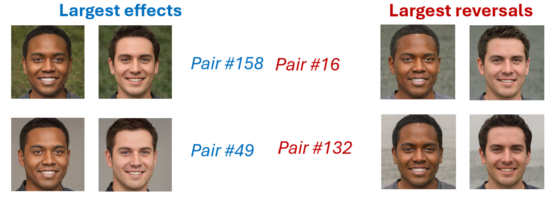
If I was shown these 8 photographs, I wouldn’t be confident there is more than 1 White and 1 Black man behind them all (White man #49 has a bit of a wider jaw?).
Here is a screenshot of many more unreal fellows:
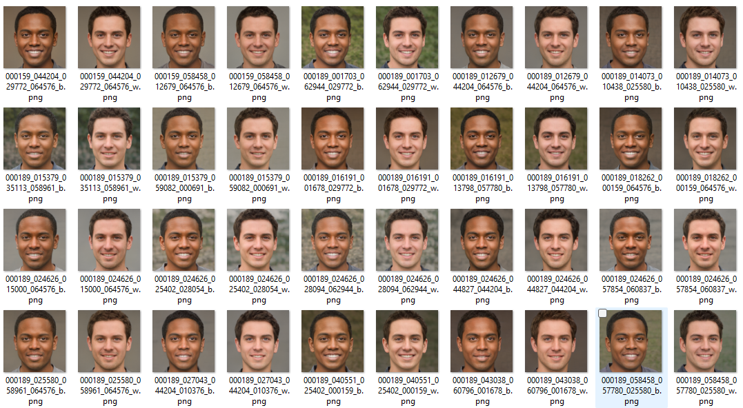
This is what I see as the study’s interesting shortcoming: their stimuli are insufficiently diverse.
While the authors have data for 197 picture pairs, it’s not clear how many meaningfully different pairs we have (this is similar to the concern of clustered data in regression analysis). I worry this thing I am pointing out will not seem like a problem to you, so I am going to elaborate a bit.
Imagine the authors had literally two photos, and they used different file names so that they had 197 pairs of file names. They would technically have 197 pairs of stimuli, but not really. They would really just have 2. No reason to expect “fictitious White man 1.jpg” will be treated differently from “fictitious White man 2.jpg” if it’s the same photograph.
The other extreme would be to have 197 photos from different people that anyone would immediately recognize as different (say, photos of random people downloaded from LinkedIn). Here we would say the study definitely had 197 pairs of stimuli.
Where does this QJE study fall in the continuum of the two extremes? I suspect imagery analysis software could quantify that, but I wouldn’t know where to start (like literally what software to use). So I didn’t.
For a quick benchmark, I went to LinkedIn and took a screenshot of 12 people listed on someone’s network.
To me they look infinitely more different even after mentally accounting for gender and age.

The concern with lack of variability is twofold: internal and external validity.
In terms of internal, if we effectively had 1 photo of a Black man and 1 of a White man, because they will have other differences, not just race, it would be ambiguous if it is race or something else driving the 3% point difference in response rate. If we have 197 very similar Black men and 197 very similar White men, the concern is very similar.
In terms of external validity, the issue is whether the stimuli used resemble the population of interest. It seems plausible that racial discrimination will be different for attractive vs unattractive men, or high vs low quality pictures, or professional vs unprofessional images, or happy vs. serious photos, etc. If all pictures are the same, we cannot hope to make inferences from the cell used in the study, to the cells not used in the study. We are answering “would this particular pair of dude twins suffer discrimination?” but we are not answering “would dudes in general suffer discrimination?”.
Ok. So that’s what I see as a problem. Insufficiently diverse stimuli. How could one choose stimuli to bypass this problem? I will talk about that in a future post when I introduce the “Mix-and-Match” approach we proposed for stimuli selection, with Andres Montealegre (postdoc at Yale) & Ioannis Evangelidis (colleague at Esade), in a recent JPSP paper.
![]()
Our policy (.htm) is to share drafts of blog posts with authors whose work we discuss, in order to solicit suggestions for things we should change prior to posting. I shared a draft with the authors of the QJE paper a bit over 2 weeks ago and they provided a thoughtful response, explaining some constraints they faced generating diverse stimuli and some benefits of having more uniform stimuli in their particular study. See Full Response (.pdf)