This is the third in a four-part series of posts detailing evidence of fraud in four academic papers co-authored by Harvard Business School Professor Francesca Gino. It is worth reiterating that to the best of our knowledge, none of Gino’s co-authors carried out or assisted with the data collection for the studies in this series.
Part 3: The Cheaters Are Out of Order
Gino & Wiltermuth (2014), Study 4
"Evil Genius? How Dishonesty Can Lead to Greater Creativity", Psychological Science
In this paper, the authors present five studies suggesting that dishonesty can lead to creativity.
Here we focus on Experiment 4, which was run online using mTurk participants. We received this dataset several years ago directly from Professor Gino.
Participants (N = 178) were first presented with a virtual coin toss task that gave them the incentive and the opportunity to cheat. After completing a scale measuring rule-following (not discussed further), participants completed two creativity tasks. Here we will focus exclusively on the results of a “uses” task, which involved asking participants “to generate as many creative uses for a newspaper as possible within 1 min” (p. 976). Other researchers have used this task as a way to assess creativity [1].
Results
Consistent with the authors' hypothesis, participants who cheated on the coin toss task came up with more uses for a newspaper (M = 8.3, SD = 2.8) than participants who did not cheat (M = 6.5, SD = 2.3), p < .0001.
The Anomaly: Out-Of-Order Observations
As in Part 1 of this series (Colada 109 .htm), the tell-tale sign of fraud in this dataset comes from how the data are sorted.
The dataset is almost perfectly sorted by two columns, first by a column called “cheated”, indicating whether participants cheated on the coin toss task (0 = did not cheat; 1 = cheated), and then by a column called “Numberofresponses”, indicating how many uses for a newspaper the participant generated.
As in Post 1, the fact that the sort is almost perfect is more problematic than it appears.
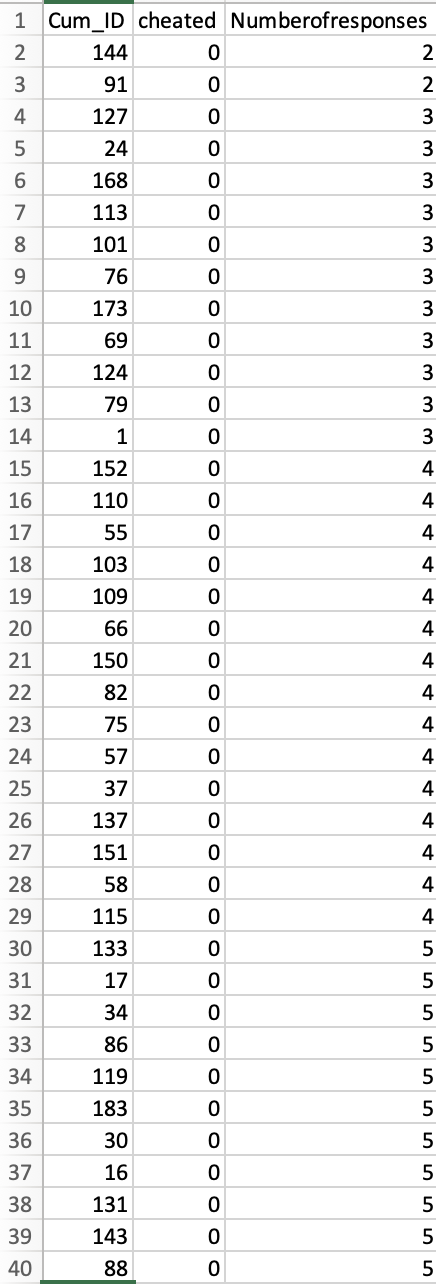
Let's look at how the data are sorted. The screenshot below depicts the first 40 observations in the dataset [2] Because the data are sorted first by the “cheated” column, all of these observations represent non-cheaters (i.e., scores of 0 in the “cheated” column), and they are perfectly sorted by the “Numberofresponses” column. Indeed, the 135 non-cheaters in the dataset are all perfectly sorted by the “Numberofresponses” column.

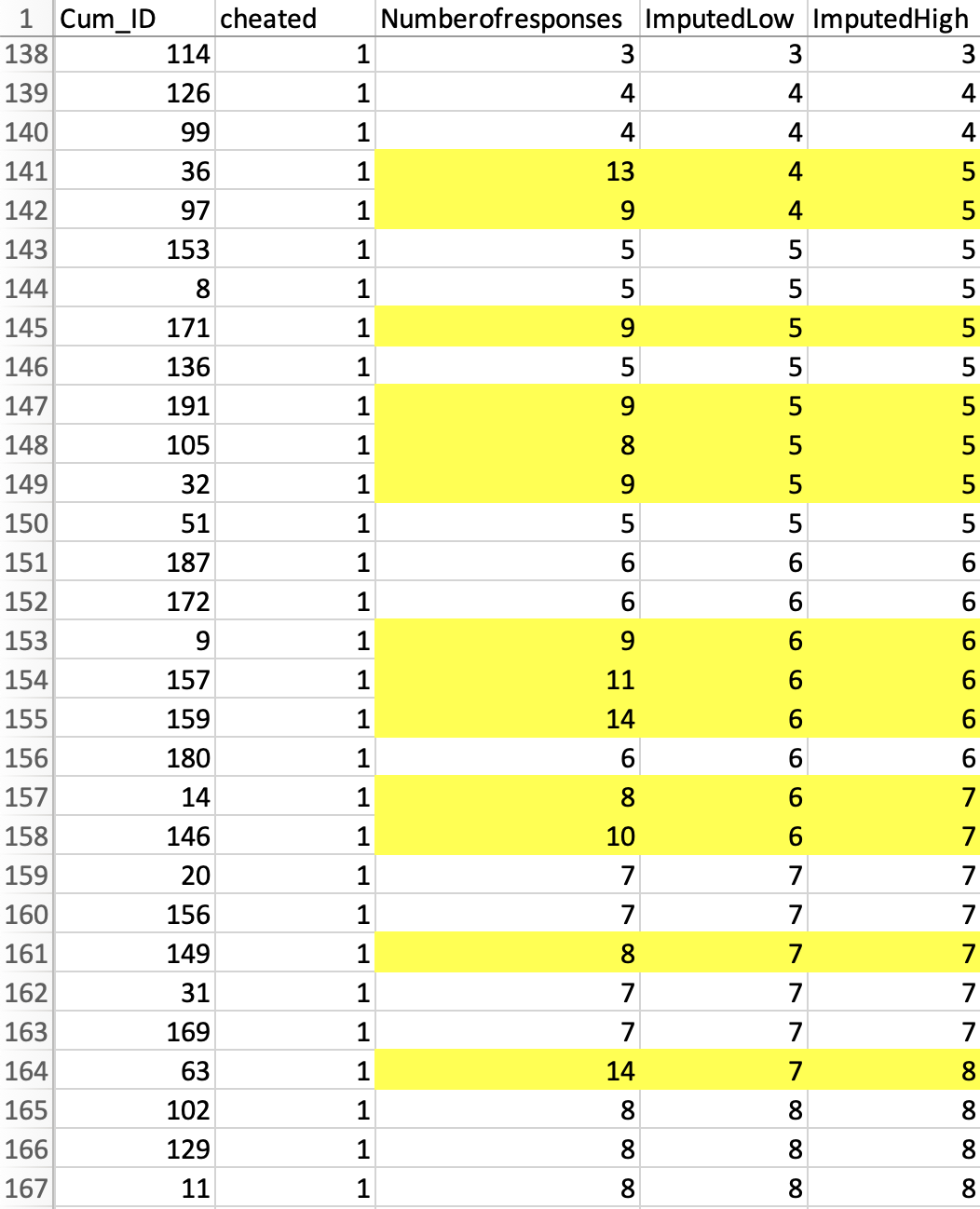
The next screenshot, in contrast, shows that while 43 cheaters are also sorted by this variable, there are 13 observations that are not in the order they should be [3]:

We believe that these observations are out of sequence because their values were manually altered (after they were sorted) to produce the desired effect [4].
There are three things to note here:
1. It does not appear possible to sort the dataset in a way that produces the order in which the data were saved. They were either originally entered this way (which is implausible, since the data originate in a Qualtrics file that defaults to sorting by time), or they were manually altered.
2. Recall that the rows are sorted by the dependent variable, "Numberofreponses". If the values that are out of order were changed, it is straightforward to figure out what they were changed from. For example, row #141 has a "13". The row above it has a "4", and the first in-sequence value after it is "5". Therefore, if the data were changed, then we can assume that this "13" used to be either a "4" or a "5".
Below you can see two new columns – “ImputedLow” and “ImputedHigh” – which have the two possible values to impute. In some cases we know exactly which number to impute, in some cases we know it within +-1.

The figure below graphically depicts the in- and out-of-sequence observations, and the imputation [5].
3. The significant relationship between cheating and creativity disappears when you analyze these imputed values, rather than those in the shared dataset. The p-value goes from p < .0001 to p = .292 (“ImputedLow”) or p = .180 (“ImputedHigh”).
Thus, if those values were equal to what their position in the spreadsheet implies that they were before being manually altered, there used to be no significant difference between cheaters and non-cheaters.
Beyond Means
Buckle up, this last section is a bit more technical. But we think it is worth it. (Obviously, since it is in the post.)
Imagine that there is truly no difference between cheaters and non-cheaters in their ability to generate uses for a newspaper. In the absence of data tampering, we’d not only expect the average number of newspaper uses to be the same between them. We’d expect the whole distribution of that variable to be the same. For example, which value lies at the 20th percentile should be the same for both cheaters and non-cheaters. And that is also true for the 50th percentile, and the 80th percentile, and the 90th…and you get the idea.
Well, when we changed those 13 values back to what we think they were, we observed not only similar means but also very similar entire distributions. You can see this in the following figure, which shows the cumulative distribution functions (CDFs) both before we changed those values back to what we think they were (left panel), and after we changed them (right panel) [6].
Now, just how similar are those distributions in the right panel? To provide a quantitative answer, we ran a Kolmogorov-Smirnov (KS) test (wikipedia), which is used to non-parametrically compare entire distributions. We get p = .456, so we do not reject the hypothesis that the two distributions are the same [7]. OK, but how impressive is that null finding? We are taking it as evidence that the 13 observations we are changing are in fact the 13 observations the data analyst tampered with and that we are just undoing their tampering. But maybe that's not true. Maybe it does not matter which 13 observations you change. What if we changed any other 13 (cheater) observations, and by the same amounts by which we changed these? Would we also get such similar distributions (i.e., such a high p-value in a KS test)?
In short: Nope.
We ran some (conservative) simulations. We took the 13 changes of values from our imputations but applied them not to the 13 observations we identified as having been changed, but instead to 13 randomly chosen cheaters' observations [8],[9]. Note that we always reduced the average of the dependent variable for cheaters by the same amount: It was always down to 6.95 (from 8.3) in every single simulation. All we varied here was which cheaters’ values we were changing. We did that one million times. Each time we assessed the similarity of the cheaters and non-cheaters with that KS test and kept track of the p-value. The results are below. We would have needed to have been extremely, ridiculously lucky to choose those 13 observations and to have gotten the distributions to be so similar across groups by chance alone.
In other words, there is (almost) no different set of 13 values that you could have changed by this amount that would have yielded two distributions that were this similar. We interpret these results as (strongly) suggesting that we have correctly identified which cells were tampered with, and by how much their values were changed.
We believe that Harvard University has access to the Qualtrics file that could have perfectly verified (or disputed) our concerns. We told them which file to get, which cells to check, and which values they would find in the Qualtrics file if we were right. We don't know if they did this, or what they found if they did. All we know is that, 16 months later, they requested that the article be retracted.
![]()
When the series is over we will post all code, materials, and data in a single ResearchBox. In the meantime:
https://datacolada.org/appendix/111
Author feedback.
Our policy is to solicit feedback from authors whose work discuss. We did not do so this time, given (1) the nature of the post, (2) that the claims made here were presumably vetted by Harvard University, (3) that the articles we cast doubt on have already had retraction requests issued, and (4) that discussions of these issues were already surfacing on social media and by some science journalists, without their having these facts, making a traditional multi-week back-and-forth with authors self-defeating.
- The other task was a 17-item Remote Associates Test. As the authors describe it (p. 974-975), "Each item consists of a set of three words (e.g., sore, shoulder, sweat), and participants must find a word that is logically linked to them (cold)." [↩]
- To create this screenshot, we had to move the “cheated” and “Numberofresponses” columns. In the dataset that Gino shared, those variables were in the 78th and 14th columns, respectively. [↩]
- We define an observation as being out-of-order if, within the same group (cheaters or non-cheaters), any values below it in the spreadsheet are smaller. [↩]
- Readers of Post 1 might be wondering whether we can use calcChain here. We can't, as this data came to us as a .csv file, not as an Excel file. [↩]
- We are using "ImputedHigh" for this graph. [↩]
- The figure uses the more conservative value, the higher one, to impute the original value. We also use the higher imputed value for the analyses below. [↩]
- Using the low imputed values the p-value is .810. [↩]
- The results are essentially the same with the low imputed values; see posted R Code. [↩]
- We ran the results bounding the DV by 1 from below and not bounding it, obtaining essentially identical results. [↩]
