This is the introduction to a four-part series of posts detailing evidence of fraud in four academic papers co-authored by Harvard Business School Professor Francesca Gino.
In 2021, we and a team of anonymous researchers examined a number of studies co-authored by Gino, because we had concerns that they contained fraudulent data. We discovered evidence of fraud in papers spanning over a decade, including papers published quite recently (in 2020).
In the Fall of 2021, we shared our concerns with Harvard Business School (HBS). Specifically, we wrote a report about four studies for which we had accumulated the strongest evidence of fraud. We believe that many more Gino-authored papers contain fake data. Perhaps dozens.
The process that ensued at HBS is confidential (for us also). But here are some things we know:
(1) As you can see on her Harvard home page (.htm), Gino has gone on "administrative leave", and the name of her chaired position at HBS is no longer listed.
(2) We understand that Harvard had access to much more information than we did, including, where applicable, the original data collected using Qualtrics survey software. If the fraud was carried out by collecting real data on Qualtrics and then altering the downloaded data files, as is likely to be the case for three of these papers, then the original Qualtrics files would provide airtight evidence of fraud. (Conversely, if our concerns were misguided, then those files would provide airtight evidence that they were misguided.)
(3) We have learned (from knowledgeable sources outside of Harvard) that a few days ago Harvard requested that three of the four papers in our report be retracted. A fourth paper, discussed in today’s post, had already been retracted, but we understand that Harvard requested the retraction notice be amended to include mention of this (additional) fraud.
(4) The evidence of fraud detailed in our report almost certainly represents a mere subset of the evidence that the Harvard investigators were able to uncover about these four articles. For example, we have heard from some HBS faculty that Harvard’s internal report was ~1,200 pages long, which is 1,182 pages longer than the one we sent to HBS.
(5) To the best of our knowledge, none of Gino’s co-authors carried out or assisted with the data collection for the studies in question.
In this series, we provide a blog-friendlier and updated version of what was in our report, plus a few additional analyses. Our report focused on four studies, and so we will write four posts, one for each study. The posts will differ in length, with this one and the fourth one being a big lengthier. We hope to publish the three remaining posts within a week.
Part 1: Clusterfake
Shu, Mazar, Gino, Ariely, & Bazerman (2012), Study 1
"Signing at the beginning makes ethics salient…." Proceedings of the National Academy of Sciences
Two summers ago, we published a post (Colada 98: .htm) about a study reported within a famous article on dishonesty (.htm). That study was a field experiment conducted at an auto insurance company (The Hartford). It was supervised by Dan Ariely, and it contains data that were fabricated. We don’t know for sure who fabricated those data, but we know for sure that none of Ariely’s co-authors – Shu, Gino, Mazar, or Bazerman – did it [1]. The paper has since been retracted (.htm).
That auto insurance field experiment was Study 3 in the paper.
It turns out that Study 1’s data were also tampered with…but by a different person.
That’s right:
Two different people independently faked data for two different studies in a paper about dishonesty.
The paper’s three studies allegedly show that people are less likely to act dishonestly when they sign an honesty pledge at the top of a form rather than at the bottom of a form. Study 1 was run at the University of North Carolina (UNC) in 2010. Gino, who was a professor at UNC prior to joining Harvard in 2010, was the only author involved in the data collection and analysis of Study 1 [2].
Study Description
Participants (N = 101) received a worksheet (.png) with 20 math puzzles and were offered $1 for each puzzle they (reported to have) solved correctly within 5 minutes.
After the 5 minutes passed, participants were asked to count how many puzzles they solved correctly, and to then throw away their worksheet. The goal was to mislead participants into thinking that the experimenter could not observe their true performance, when in fact she could, because each worksheet had a unique identifier. Thus, participants could cheat (and earn more money) without fear of being caught, while the researchers could observe how much each participant had cheated.
Participants then completed a “tax” form reporting how much money they had earned, and also how much time and money they spent coming to the lab. The experimenters partially compensated participants for those costs.
In sum, participants had an opportunity and incentive to lie about how many puzzles they solved correctly, and about the costs they incurred to come to the lab.
The study manipulated whether the tax forms required participants to sign at the top or at the bottom (or not at all).
Results
The paper reported very large effects. Signing at the top vs. the bottom lowered the share of people over-reporting their math puzzle performance from 79% to 37% (p = .0013), and lowered the average amount of over-reporting from 3.94 puzzles to 0.77 puzzles (p < .00001). Similarly, it nearly halved the average amount of claimed commuting expenses, from $9.62 to $5.27 (p = .0014).
The Data Anomaly: Out-of-Order Observations
We obtained the data from the Open Science Framework (.htm), where it has been posted since 2020, as a result of a replication (.htm) conducted by a team of researchers that included the original authors.
The posted data seem to be sorted by two columns, first by a column called “Cond”, indicating participants’ condition assignment (0 = control; 1 = sign-at-the-top; 2 = sign-at-the-bottom), and then by a column called “P#”, indicating a Participant ID number assigned by the experimenter.
For example, the screenshot below shows a portion of that spreadsheet, with some observations from the sign-at-the-top and sign-at-the-bottom conditions. You can see that within each condition the data are almost perfectly sorted by Participant ID (the first column on the left).
What's relevant here is precisely that the sorting is only almost perfect.
We’ve highlighted 8 observations that are either duplicated or out-of-sequence [3]:
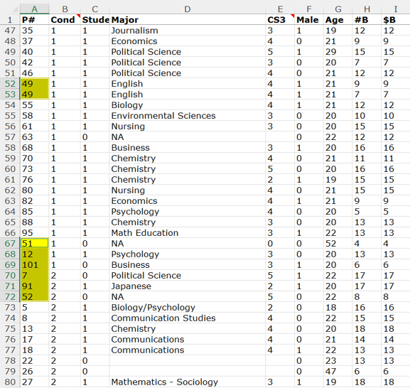
Participant ID 49 appears twice in the dataset, with identical demographic information. In addition, there are 6 participants in adjacent rows with IDs out of sequence, three from condition 1 (Sign At The Top), then three in condition 2 (Sign At The Bottom).
This is much more problematic than it may appear.
There is no way, to our knowledge, to sort the data to achieve this order. This means that these rows of data were either moved around by hand, or that the P#s were altered by hand. We will see that it is the former.
If this data tampering was done in a motivated fashion, so as to manufacture the desired result, then we would expect those suspicious observations to show a particularly strong effect for the sign-on-the-top vs. sign-on-the-bottom manipulation.
And they do.
Suspicious Rows Show A Huge Effect
The figure below shows all observations in the two conditions of interest. The 8 suspicious observations mentioned above show a huge effect in the predicted direction. They are all among the most extreme observations within their condition, and all of them in the predicted direction.
With just n = 8 they produce t(6) = 21.92, with a miniscule p-value. The t-test for the other dependent variable, overreported performance on the puzzle task, is less extreme, but still produces t(6) = 4.48, p = .004 with just 8 observations.
.csv file and R Code to reproduce analyses.
Excel files contain multitudes
The data for Study 1 were (also) posted as an Excel file (.xlsx). And that Excel file contains formulas. From a data forensic perspective, this is extremely valuable.
A little known fact about Excel files is that they are literal zip files, bundles of smaller files that Excel combines to produce a single spreadsheet [4]. For instance, one file in that bundle has all the numeric values that appear on a spreadsheet, another has all the character entries, another the formatting information (e.g., Calibri vs. Cambria font), etc.
Most relevant to us is a file called calcChain.xml.
CalcChain tells Excel in which order to carry out the calculations in the spreadsheet. It tells Excel something like "First solve the formula in cell A1, then the one in A2, then B1, etc." CalcChain is short for 'calculation chain'.
The image below shows how, when one unzips the posted Excel file, one can navigate to this calcChain.xml file (it is easier to read .xml files in a browser, say Firefox).
CalcChain is so useful here because it will tell you whether a cell (or row) containing a formula has been moved, and where it has been moved to. That means that we can use calcChain to go back and see what this spreadsheet may have looked like back in 2010, before it was tampered with!
Let's first see a concrete example of how one can use calcChain to do this.
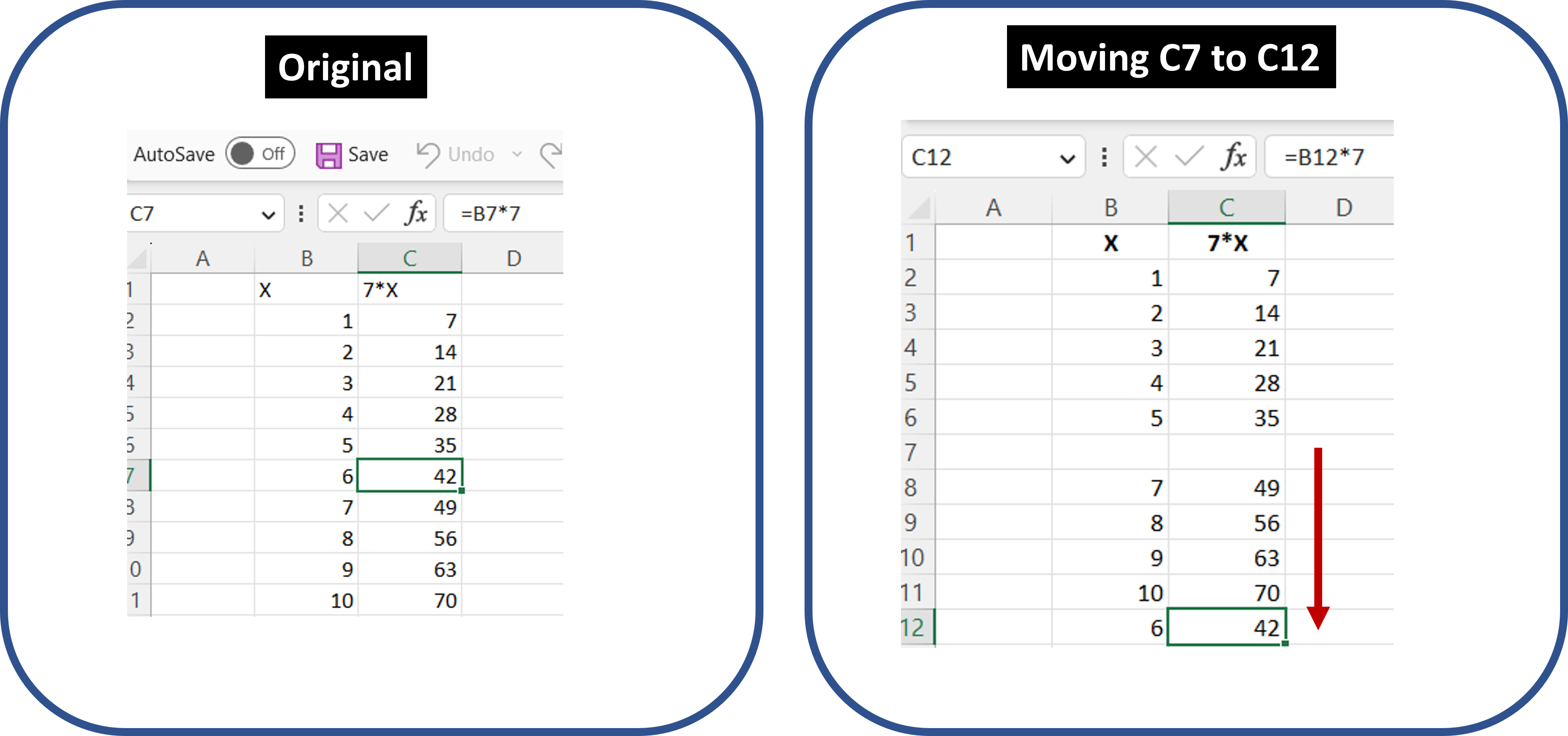
Say you create a multiplication table in Excel for the number 7. Column B has numbers 1-10 typed-in, and Column C has formulas like "=B7*7". See the left panel below.
Let's say we decide to tamper with this multiplication table and move row 7 to row 12, as in the right panel above.
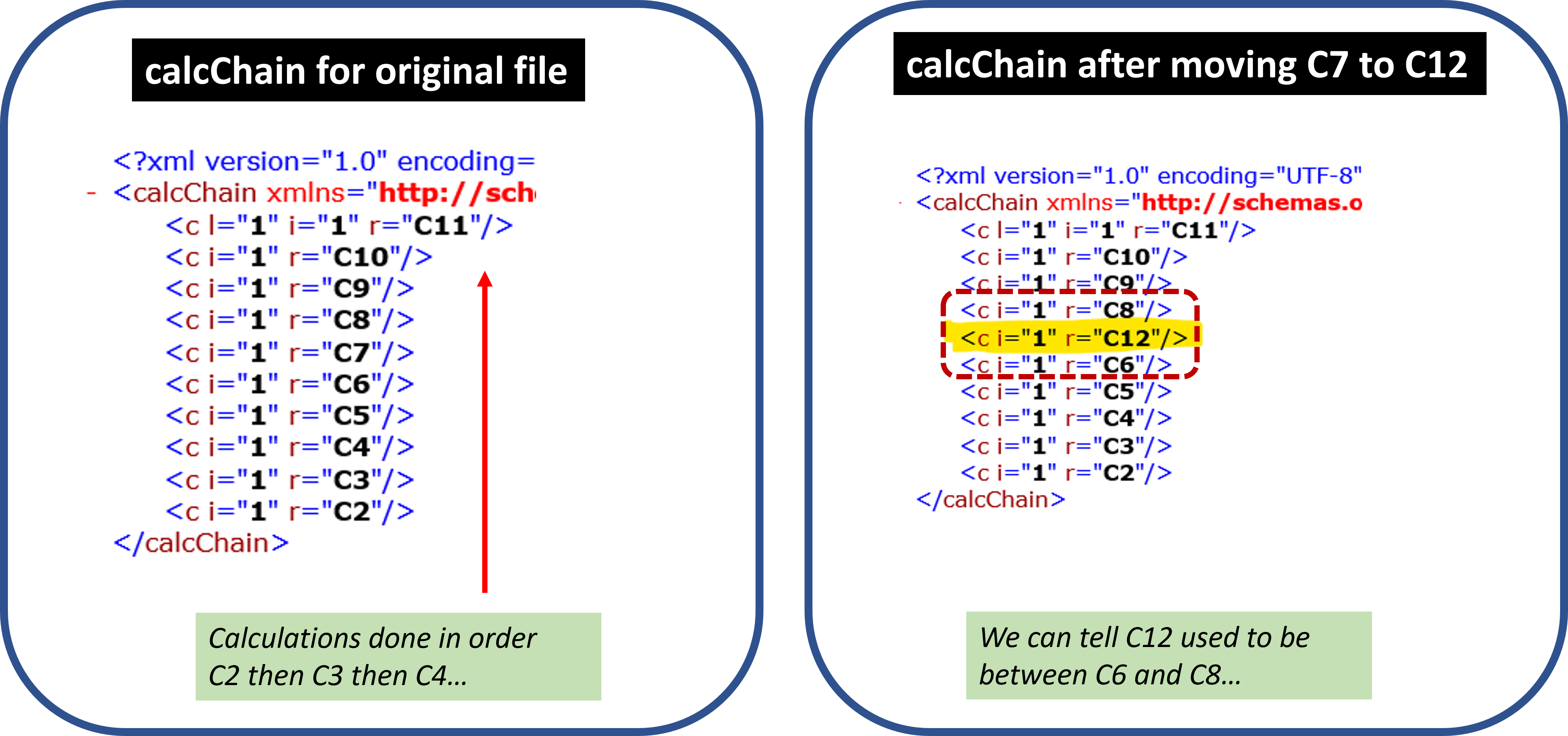
Because column C has formulas, calcChain needs to record in which order to solve them. Importantly, it will have the order in which those formulas were initially entered into the spreadsheet. It will indicate to first solve C2, then C3, and so on. Critically, when a cell is moved, its order of calculation is not. That means that in the example above, Excel continues to compute 6*7 right after it computes 5*7, and right before it computes 7*7, no matter where you move that cell to.
The image below shows the clunky way in which calcChain stores that information for the example above (in .xml format). Despite its clunkiness, it's easy enough to use it to figure out that for the spreadsheet on the left all calculations are in a predictable sequence, and that for the spreadsheet on the right, what is now in cell C12 used to be between cells C6 and C8.
Now, with that crash course on calcChain behind us, let's put it to use in the posted Excel file for Study 1 from that PNAS paper.
Applying calcChain to Study 1
We used calcChain to see whether there is evidence that the rows that were out of sequence, and that showed huge effects on the key dependent variables, had been manually tampered with. And there is.
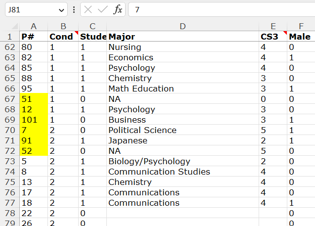
For your convenience, here is a smaller spreadsheet screenshot, highlighting the six out-of-sequence rows.
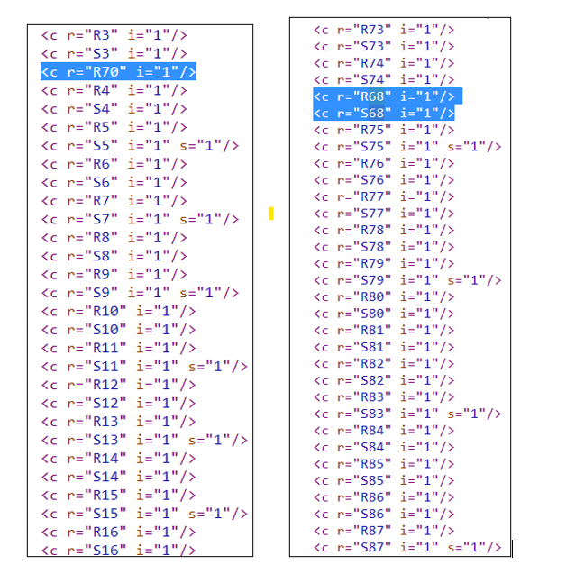
Let’s look up those 6 rows on calcChain.
1. Row 70.
Looking up row 70 in calcChain reveals something almost as easy to parse as the multiplication table above. Row 70 used to be between rows 3 and 4.
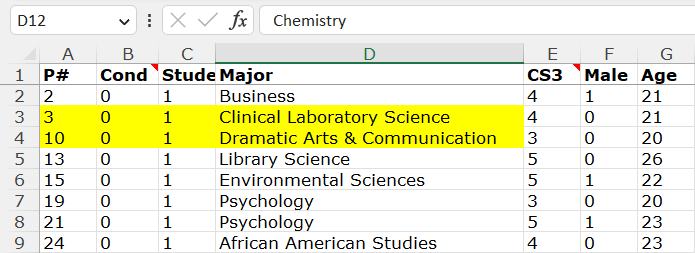
Rows 3 and 4 are obviously at the top part of the spreadsheet (see screenshot below). And because the spreadsheet is sorted by condition, those rows are in Condition 0, which is the control condition. This means that row 70, now in Condition 2, used to be surrounded by rows that were in Condition 0.
Additionally, notice that rows 3 and 4 have participant IDs #3 and #10. Row 70, remember, has ID #7, so it used to be, before it was moved by hand, in exactly the expected position (between 3 and 10) if (1) that observation was originally in Condition 0, and (2) the spreadsheet was sorted by condition and ID, as it is.
All of this strongly suggests that row 70 was moved from the control condition (Condition 0) to the sign-at-the-bottom condition (Condition 2).
Analyses of calcChain for the 5 other out-of-sequence observations similarly support the hypothesis that an analyst (manually) moved observations from one condition to the other. Click the links below to see them.
When the series is over we will post all code, materials, and data on a single ResearchBox. In the meantime:
https://datacolada.org/appendix/109/
![]()
Author feedback.
Our policy is to solicit feedback from authors whose work discuss. We did not do so this time, given (1) the nature of the post, (2) that the claims made here were presumably vetted by Harvard University, (3) that the articles we cast doubt on have already had retraction requests issued, and (4) that discussions of these issues were already surfacing on social media and by some science journalists, without their having these facts, making a traditional multi-week back-and-forth with authors self-defeating.
- We know the co-authors did not fake the data both because all five authors, including Ariely, agreed that Ariely provided the data to the research team, and because emails from that time, and metadata from the relevant data files, show that the fraudulent data came to the research team from Ariely's computer via emails he sent to co-authors. [↩]
- We suspect Study 2 is fake as well, but here we focus on Study 1. [↩]
- There is a 9th out-of-sequence observation in the control condition, outside this screenshot [↩]
- If curious or incredulous, run any .xlsx file in your computer through the program you use for unzipping files; you will find a bunch of files organized in folders [↩]
