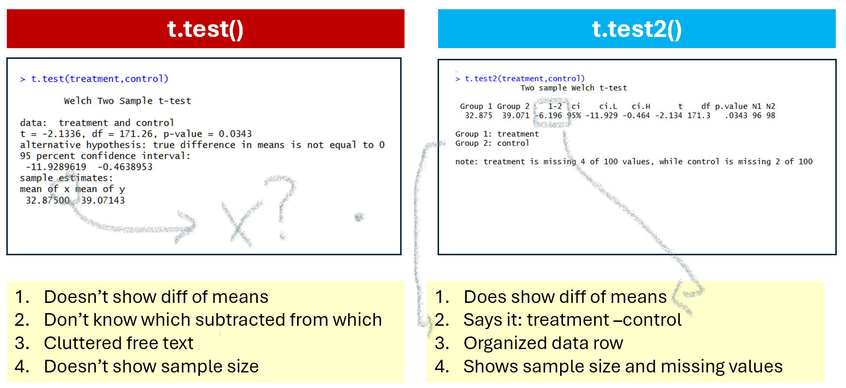
t.test(), the R function for running t-tests, is disconcertingly imperfect.
A t-test involves computing the difference between two means. And yet, t.test(), does not report… …said difference of means. It reports the p-value for the difference of means, it reports the confidence interval for the difference of means, but not the difference of means itself. This is particularly annoying when teaching, as I try to focus students’ attention away from the p-value, and that’s harder without a point estimate to focus their attention into instead. The t.test() moreover, often does not even tell you whether it computed A – B or B – A, so you have a confidence interval where you cannot interpret the sign easily. Statisticians: think of the children!
Preparing for my teaching this term, I thought I would try to write a better t-test function for R. An expensive branding consultant landed on calling it t.test2().
It has the same back-end, but the front-end is hopefully more useful for the humans.
I used Cursor, coding it with AI assistance, and the experience was pleasant enough that I then thought, hm, table() is another pretty bad function, i could improve that as well. So I wrote table2(). One thing led to another, I wrote lm2(), text2(), list2()… I put them in a new package I called statuser because it is written with users of statistical tools in mind. That package is now on CRAN, so you can install it with install.packages('statuser'). If you try it, I welcome all suggestions.
I get the sense that many packages are written assuming users will be as familiar with the tools in the package as those writing the package, and this is obviously not true. Many packages are also written to produce results without paying much attention to readability, interpretability, or formatting of those results. statuser is different. Functions produce self-contained output, often with explanations, and produce publication-ready figures in one line of code.
This post highlights a few of the functions in the starting lineup in statuser
Function 1: t.test2()
Let’s look at the output of t.test() vs. t.test2() side by side
In terms of saving the output. If you save t-test results:
t1=t.test(x,y), you get a list with some obscure naming conventions (e.g., the degrees of freedom are saved under ‘parameter’).
t2=t.test2(x,y), you get a data row, just like the one shown on the console.
Function 2. table2()
Another super basic base R function I tried to improve is table(); it tabulates and cross-tabulates frequencies.
It has a few issues. First, when crossing two variables, table() does not show which variable is rows and which columns (Figure 2),
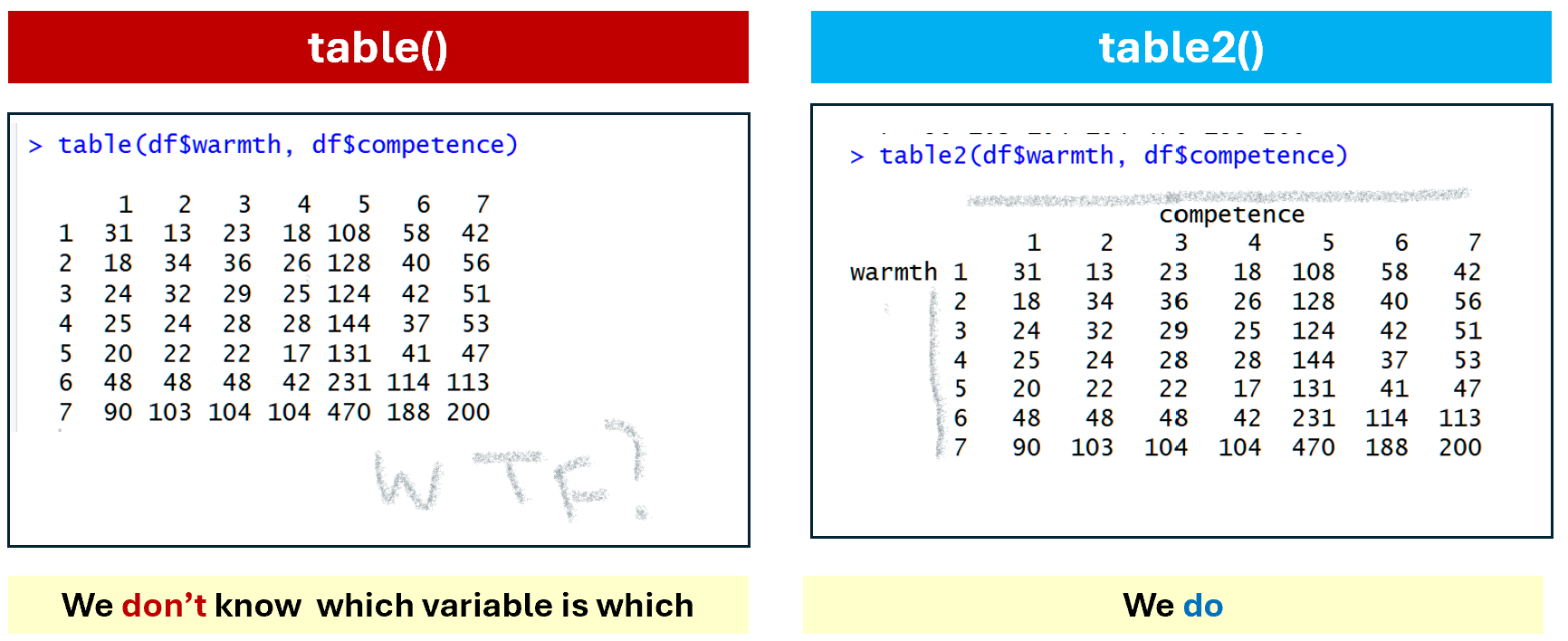
Fig 2. table() vs table2() for variable names
The second big shortcoming of table() is that to show proportions instead of frequencies you need a second clunky function, prop.table(), and to run a chi-square test you need a third function chisq.test(). With table2() you achieve all of that in one brief intuitive call: table2(x,y,prop='column', chi=TRUE)
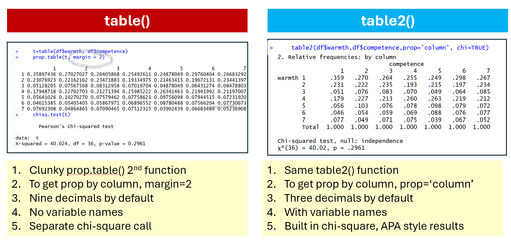
Fig 3. Tabulating proportions in table() vs table2()
Function 3. desc_var()
It can be surprisingly clunky to obtain summary stats by group in R.
There is aggregate(), a function that is not impossible to use.
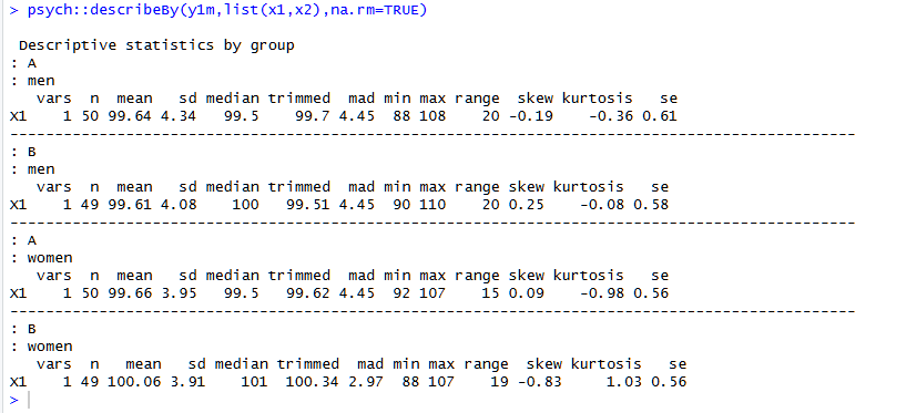
The statuser alternative is desc_var():
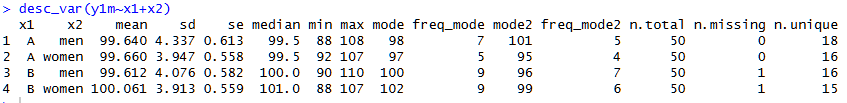
It shows the usual stuff, in an orderly fashion, but also number of unique and missing values, which is quite useful too. See footnote for contrast with psych::describeBy() [1]
Functions 4-6: Descriptive plots
I wished all papers showed descriptive plots before showing data analysis, so I included in statuser functions that create publication-ready descriptive-plots with a single line of code. Three functions: one for CDFs, one for frequencies, and one for densities.
Function 4: plot_cdf()
I think CDFs plots can be especially useful when considering two groups that do not differ from each other on average. This one line of code produces the entire figure. In that figure I put two groups that do differ, to more easily appreciate all the output that’s generated.
plot_cdf(widgetness~gender)
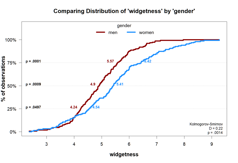
The p-values at 25th, 50th, and 75th percentile come from quantile regressions.
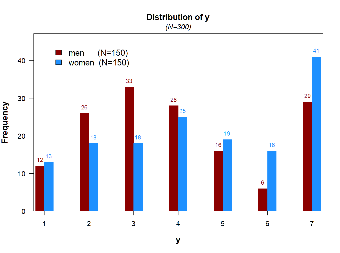
Function 5: plot_freq()
When the DV takes a few values, a frequency plot may be more informative.
Again, publication ready figure with one line of code.
plot_freq(y~gender)
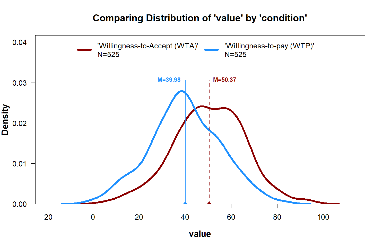
Function 6: plot_density()
When one does find an effect, but the variable is continuous, plotting the density can be better.
plot_density(value~condition)
Function 7. twolines()
In Colada[131] I re-analyzed data behind a recently published claim that the impact of AI use on creativity was U-Shaped, by running the two-lines test on the posted data. I did the analysis on a stand-alone online app.
But now that test is also part of statuser. To reproduce the two-lines figure in Colada 131:
twolines(Creativity ~ HumanAI +Intrinsic+Creative_Requirement+ Consc+Open,data=df)
Other functions
lm2():linear regression with informative output (Colada[133], the next post, will explain robust standard errors, and propose getting them withlm2())message2(): like message() but with color, and can stop executiontext2(): like text() but you can do text(‘hello’, align=’left’, bg=’red’)scatter.gam(x,y): makes scatterplot, with a best fitting GAM curvelist2(x,y)a list where you don’t need to name objects, list2(x,y) = list(x=x,y=y)
Github: https://github.com/urisohn/statuser
How to install in R
groundhog.library('statuser', date)
or
install.packages('statuser')
If you check it out, let me know what’s wrong with it, or what you wished it included.
![]()
Footnotes.
- Comparing statuser::desc_var() with psych::describeBy()
The syntax for describeBy is a bit clunkier, as you need to enter multiple groups as a list, and the output feels cluttered to me. I haven’t used skew or kurtosis before, but I always want to know about missing and unique values:
[↩]